When it comes to turning visitors into customers, few things are as powerful as a well-designed landing page. But here’s the truth: most landing pages don’t perform as well as they could not because of bad products or poor offers, but because they miss the key conversion elements that persuade users to take action.
In this guide, you’ll learn what those high-performing elements are, how to design them effectively, and how to apply proven psychological principles to make your landing pages more persuasive. Whether you’re building one from scratch or improving an existing page, this article will help you design landing pages that don’t just look good but convert better.
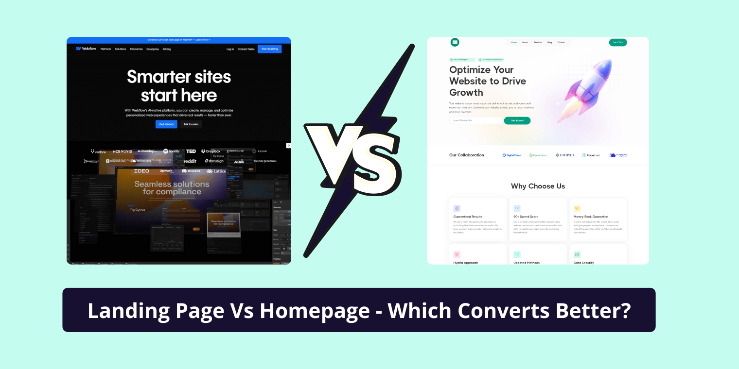
A landing page is a dedicated web page built with a single purpose to drive an action. That action could be signing up for a newsletter, booking a service, downloading an eBook, or buying a product. Unlike a homepage, which is designed to navigate users across your site, a landing page is laser-focused on one clear goal.
The elements you place on this page from your headline and imagery to your CTA and trust badges directly influence how users behave. Conversion-focused landing pages are built on the foundation of psychology, data, and user experience (UX). Every design choice, every word of copy, every image serves one purpose: to guide the user toward conversion.
Professionals in Conversion Rate Optimization (CRO) stress that good design isn’t enough. What matters is the clarity of your offer, the ease of decision-making, and the trust you build in the few seconds you have to capture attention.
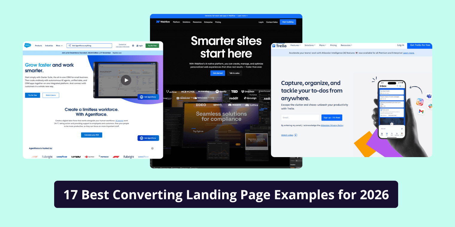
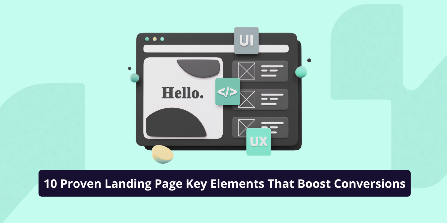
10 Essential Landing Page Elements That Boost Conversions
1. A Compelling Headline That Hooks Instantly
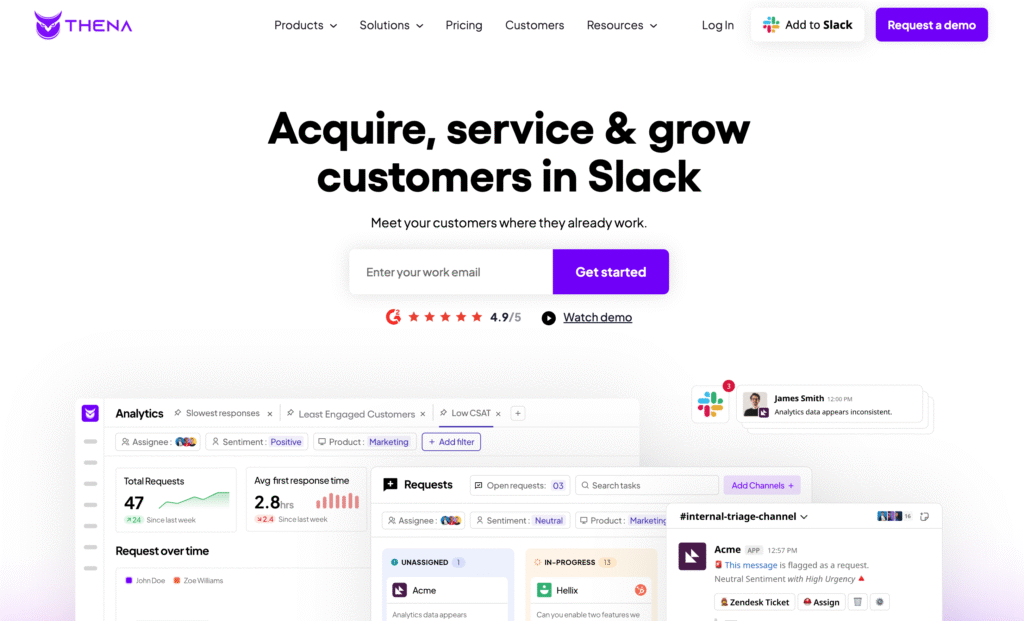
Your headline is the first thing users see and the one that decides whether they’ll stay or bounce. It should be crystal clear about what you’re offering and why it matters. The best headlines don’t try to be clever; they try to be clear.
Use emotionally charged yet simple language that promises a benefit. For example, instead of saying “Our software helps teams collaborate better,” say “Cut project chaos — bring your team together in one place.” Always A/B test multiple headlines, because even subtle changes can lead to significant conversion lifts.
2. A Clear and Visible Call-to-Action (CTA)
Your CTA is the climax of your landing page it’s what you want visitors to do. Whether it’s “Get Started,” “Book a Free Call,” or “Download Now,” your CTA button should be easy to find and visually stand out.
Use contrasting colors, concise action verbs, and repeat the CTA where it makes sense (especially above the fold and at the bottom). Avoid vague phrases like “Submit” or “Learn More.” Instead, make it specific to the value: “Claim My Free Trial” or “See Pricing.”
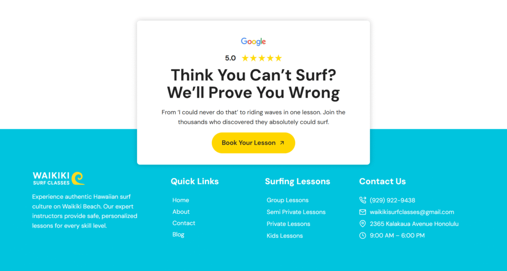
3. Trust Signals and Social Proof
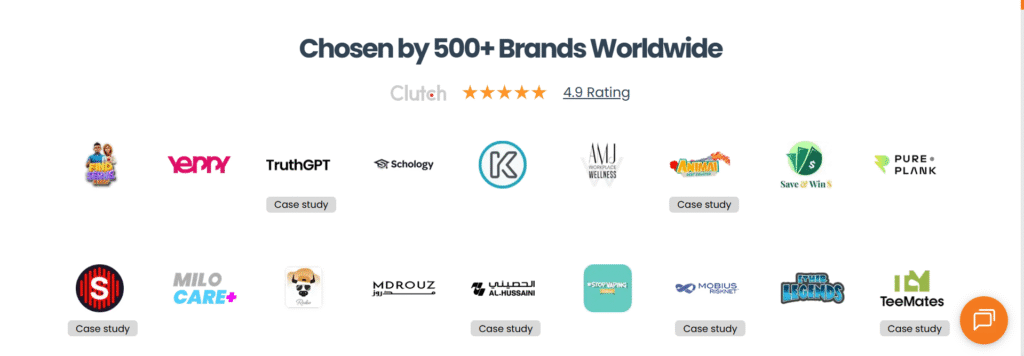
Trust is everything. Before users click your CTA, they need to feel safe emotionally and financially. That’s where trust signals come in.
Displaying testimonials, star ratings, client logos, or case studies helps visitors see that others have benefited from your product or service. Social proof, such as user counts (“Trusted by 10,000+ businesses”) or verified reviews, can make a huge difference.
If possible, include authentic photos of real customers, not stock images. Visual credibility increases perceived authenticity, which directly impacts conversions.
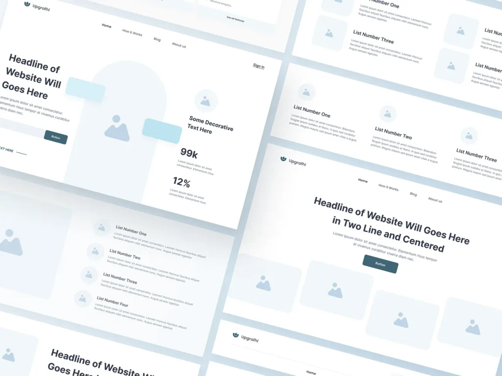
4. Visual Hierarchy and Design Simplicity
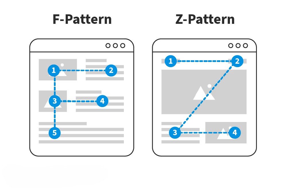
A clean, focused design keeps users’ attention where it matters most. The goal isn’t to impress it’s to guide.
Follow a visual hierarchy that naturally draws the eye toward your headline, supporting copy, and CTA. Use white space strategically to avoid overwhelming users, and stick with two or three primary colors that align with your brand identity.
Patterns like the “F” or “Z” layout reflect natural eye movement and help position elements where users expect them. The fewer distractions, the smoother the conversion journey.
5. High-Quality Visuals or Product Imagery
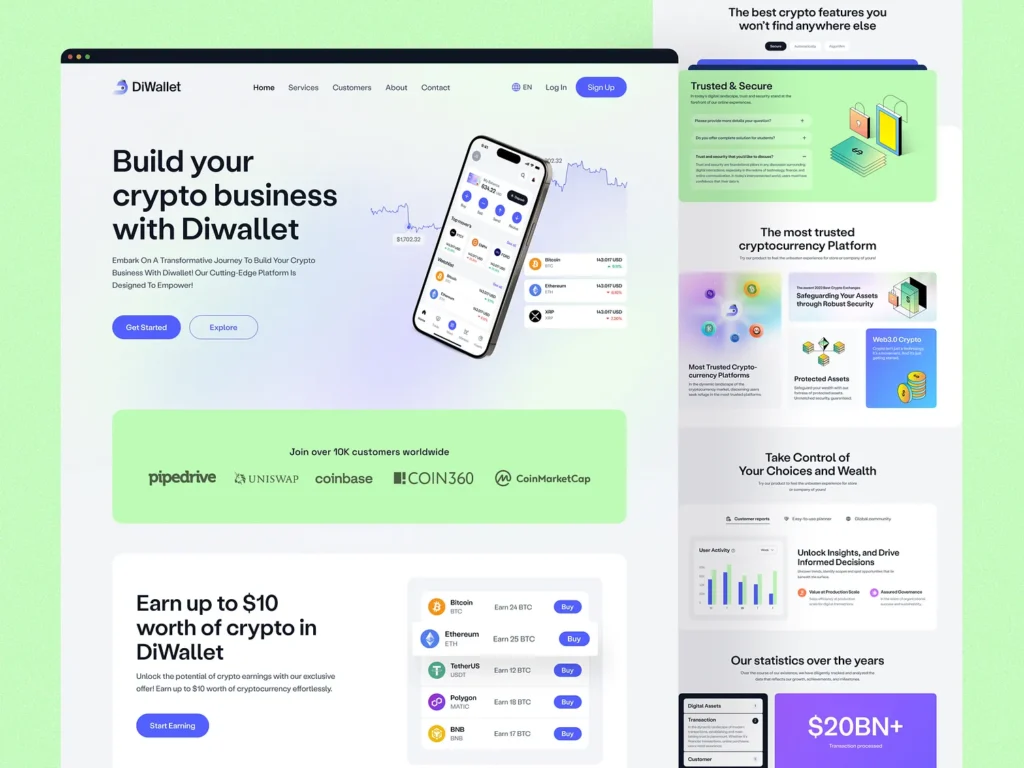
A landing page is as much about what users see as what they read. High-quality visuals make your page feel professional and trustworthy.
For eCommerce brands, product photos should be well-lit and detailed. For service-based businesses, authentic team photos or explainer videos can humanize your offer. A short, 30–60 second video explaining your value proposition can increase conversions by as much as 80%, according to multiple CRO studies.
Avoid low-resolution or generic stock photos they can reduce credibility instead of building it.
6. Persuasive Copywriting and a Strong Value Proposition
Words sell. And on a landing page, the right words can make all the difference. Your copy should answer three simple questions:
- What are you offering?
- Why should I care?
- What’s the next step?
Start with a value proposition that communicates your biggest benefit — what problem do you solve, and how does it make the user’s life easier? Use short paragraphs, conversational tone, and focus on benefits, not features.
For example, instead of saying “We provide cloud storage with 1TB space,” say “Store and access all your files securely, anytime, anywhere.” That’s the difference between technical info and persuasive value.
7. Fast Loading Speed and Mobile Optimization
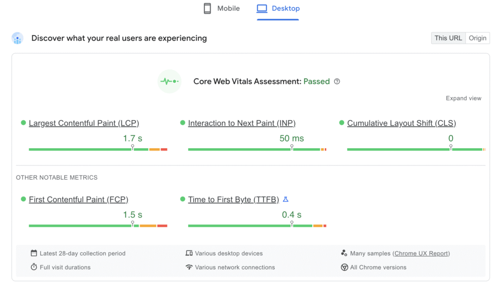
No matter how stunning your page looks, if it takes too long to load, users will leave. Research shows that even a one-second delay in load time can reduce conversions by up to 20%.
Use tools like Google PageSpeed Insights or GTmetrix to check performance. Compress images, use caching, and optimize your code.
Don’t forget mobile users more than 60% of web traffic comes from mobile devices. Responsive layouts, large buttons, and concise copy ensure a seamless experience on every screen size.
8. Optimized Lead Forms
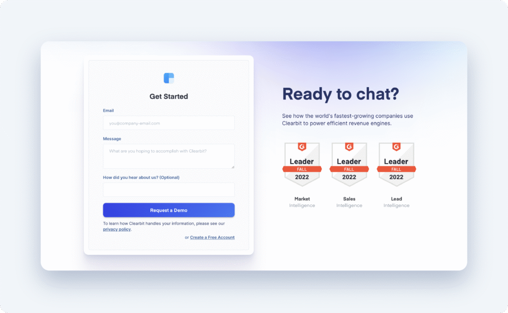
If your goal is to capture leads, your form design can make or break conversions. Long or complicated forms create friction. Keep them short only ask for information that’s absolutely necessary.
Use autofill where possible and assure users that their data is safe. A small line below the button saying “We respect your privacy” or showing a lock icon can significantly improve submission rates.
Progressive forms where users provide one piece of information at a time also reduce drop-offs, especially for longer signup processes.
9. Clear Navigation and a Distraction-Free Layout
A landing page should have one purpose one goal and one primary CTA. That means no unnecessary menu bars or outbound links that pull visitors away.
Eliminate distractions like unrelated popups, multiple offers, or long navigation menus. Keep your messaging focused and your flow frictionless.
The most effective landing pages are like guided tunnels there’s only one path forward: toward conversion.
10. A/B Testing and Analytics Tracking
Even the most well-designed page can be improved. A/B testing helps you discover what resonates most with your audience.
Test variations of your headlines, CTAs, form lengths, or even button colors. Use tools like Google Optimize, Hotjar, or Crazy Egg to track user behavior with heatmaps and scroll maps.
Data doesn’t lie if something’s not converting, test, refine, and iterate. CRO is an ongoing process, not a one-time setup.
Psychological Triggers That Influence Conversions
Design and copy are just half the equation; psychology drives the rest. Successful landing pages leverage behavioral triggers that influence decision-making.
FOMO (Fear of Missing Out) creates urgency for example, limited-time offers or countdown timers can nudge users to act now.
Reciprocity works when you offer value first, like a free guide or trial, making visitors feel compelled to give something back.
Authority bias is powerful when you feature endorsements, certifications, or expert reviews. People trust credibility.
Social validation (testimonials, user stats, ratings) shows that others have already benefited, making your offer more appealing.
Use these principles ethically the goal is to help users make confident decisions, not manipulate them.
How to Audit and Improve Your Landing Page Conversion Rate
If your landing page isn’t performing as expected, don’t guess what’s wrong diagnose it. Start with heatmaps and session recordings to see where users are dropping off or losing interest.
Ask these questions:
- Are users scrolling to your CTA?
- Do they hover over certain sections more than others?
- Is your load time acceptable?
Based on insights, create a conversion audit checklist:
- Headline clarity — does it communicate value in under 5 seconds?
- CTA placement — is it visible without scrolling?
- Form friction — too many fields?
- Trust elements — are testimonials visible?
- Page speed — under 3 seconds?
Implement improvements one step at a time, measure the results, and continue optimizing.
Tools and Software to Optimize Landing Page Conversions
There’s no shortage of tools to help you design, test, and optimize your landing pages.
Unbounce and Instapage allow you to create and test pages without coding. HubSpot provides integrated landing page builders with CRM tracking. For analysis, tools like Google Analytics, Hotjar, and Crazy Egg offer deep insights into user behavior.
If you’re serious about CRO, using these tools together design + analytics + automation can give you a complete feedback loop to maximize conversions.
Expert Tips for Designing Trustworthy Landing Pages
Trust is the foundation of conversion. Make sure your page looks legitimate and safe.
- Always use HTTPS.
- Include a privacy policy, contact information, and about section.
- If you’re featuring expert advice, add author bios or credentials to align with EEAT (Experience, Expertise, Authoritativeness, Trust).
- Show your business address, social links, and real testimonials.
Transparency isn’t just good ethics it’s good business.
Common Mistakes That Kill Landing Page Conversions
Many marketers unknowingly sabotage their conversions by overlooking small details. Here are the most common pitfalls:
- Overloaded text: Too much information overwhelms users.
- Poor mobile design: Buttons too small, text hard to read.
- Weak CTAs: Vague, passive, or hidden at the bottom.
- Slow loading speed: Users leave before the page even loads.
Simplify, clarify, and test everything. That’s how you turn more traffic into results.
Key Takeaways
- Every landing page should focus on clarity, simplicity, and a single goal.
- Strong headlines and visible CTAs drive the majority of conversions.
- Social proof and trust signals (like reviews or certifications) build credibility fast.
- Design and psychology work hand-in-hand — visuals guide attention, emotions drive action.
- Testing and optimization never end; the best landing pages evolve through data.
FAQ’S
What makes a landing page convert?
A landing page converts when it delivers a clear value proposition, strong headline, persuasive copy, and a visible call-to-action (CTA). Trust signals like testimonials and fast load speed also increase conversions. Simplicity, relevance to user intent, and focused design keep visitors engaged and guide them toward taking action.
What are the key elements of a landing page?
The key elements of a high-converting landing page include a compelling headline, engaging visuals, clear CTA buttons, trust indicators, persuasive copy, fast page speed, and mobile responsiveness. Each element works together to communicate value, build trust, and reduce friction in the user’s decision-making process.
How to write a converting landing page?
To write a converting landing page, start with a clear and benefit-driven headline. Use short, persuasive copy that focuses on solving the visitor’s problem. Highlight your unique value proposition, add social proof, and end with a strong CTA that tells users exactly what to do next. Keep tone conversational and direct.
What is the formula for landing page conversion rate?
The conversion rate formula is:
Conversion Rate = (Number of Conversions ÷ Total Visitors) × 100.
For example, if 50 out of 1,000 visitors complete your goal (like filling a form or making a purchase), your conversion rate is 5%. Tracking this metric helps measure landing page performance and optimization success.
What are the common landing page mistakes?
Common landing page mistakes include unclear messaging, too many distractions, weak CTAs, slow load times, and lack of mobile optimization. Overloading users with text, using generic stock images, and failing to build trust with testimonials or security badges also lower conversions. Focus on clarity, speed, and user experience.