Color is one of the strongest non-verbal communication tools in design. On a landing page, the right colors can increase trust, improve clarity, and guide visitors toward taking action while the wrong ones can confuse users or reduce conversions.
This guide breaks down the psychology of color, how to choose the best palette for your landing page, and how top brands use color to influence user decisions.
What Is Color Psychology in Landing Pages?
Color psychology refers to the study of how colors affect human behavior and decision-making. In landing page design, it means choosing colors intentionally to influence mood, improve clarity, reduce friction, and guide users toward the action you want them to take.
For example, blue often conveys trust, which is why it’s used heavily in SaaS and finance. Orange and green are high-performing CTA colors because they stand out without feeling aggressive. Black and white establish simplicity and modernity for premium brands.
The goal is simple: match the emotional meaning of colors with the intent of your landing page and the mindset of your audience.
Why Color Psychology Matters for Landing Page Conversions
When a user arrives on a landing page, they subconsciously answer questions like:
Is this trustworthy? Is it professional? Does this feel safe? Does the CTA stand out? Is this brand for me?
Color plays a major role in shaping these perceptions. Studies in neurasthenics show that humans use color as a shortcut for decision-making. Colors also influence cognitive load poor color contrast or mismatched palettes force the brain to work harder, increasing drop-off rates.
Key Benefits
- Builds trust (blue for finance, healthcare, SaaS)
- Grabs attention (red or yellow for urgency)
- Improves readability & hierarchy
- Increases CTA click-through rate
- Reduces cognitive load, guiding visitors smoothly
EEAT-backed reason: Research in UX design and behavioral psychology confirms that color associations influence user actions and first impressions (often formed in 0.1 seconds).
The Science Behind Color Psychology
Understanding why colors influence behavior helps you design landing pages users instantly trust.
1. Emotional Triggers
Warm colors create energy and urgency. Cool colors create calmness and trust. Neutrals create balance and sophistication. These emotional responses influence how users feel about your brand and how quickly they make decisions.
2. Cultural Associations
Color meaning varies globally. For example:
- Red represents danger in Western cultures but symbolizes luck and prosperity in Asia.
- White signifies purity in the West but is linked to mourning in some Eastern cultures.
If your landing page targets a global audience, cultural psychology should guide your palette.
3. Contrast and Readability
Color contrast affects how easily users can consume your content. Poor contrast leads to eye strain, especially on mobile devices. Pages with strong visual hierarchy convert significantly better because users immediately understand where to look.
4. Saturation and Temperature
Soft, desaturated colors feel modern and premium. Highly saturated colors feel loud and energetic. Warm colors feel active. Cool colors feel calm. Understanding this helps you match your palette with your brand’s personality.
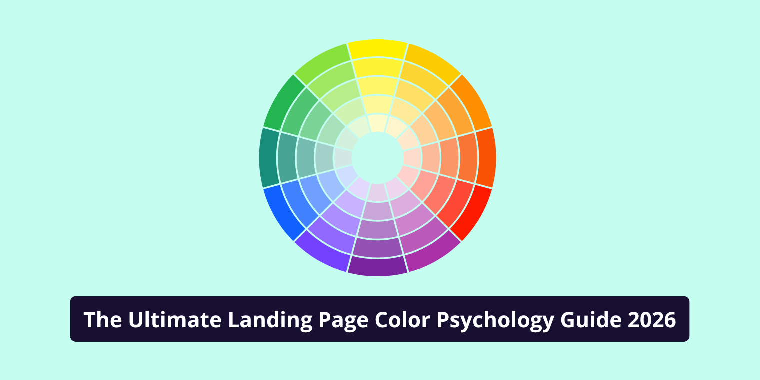
Color Meanings & Their Impact on Landing Page Performance
Here’s how each major color influences user perception:
Red
Red creates urgency, excitement, and intensity. It works well on pages designed to trigger immediate action—flash sales, limited-time offers, or scarcity-based funnels. But it can feel aggressive if overused, especially for luxury or wellness brands.
Blue
Blue communicates trust, safety, and reliability. It is one of the most converted colors for industries like SaaS, healthcare, law, and finance. Blue tends to reduce anxiety and increase perceived credibility.
Green
Green represents balance, growth, and reassurance. It works beautifully for wellness, eco-friendly products, finance (growth), and anything involving nature or calmness. Green is also effective for confirmation messages (“Success!”).
Orange
Orange is friendly, energetic, and attention-grabbing. It’s one of the most successful CTA colors because it attracts attention without feeling aggressive like red.
Yellow
Yellow signals optimism, excitement, and alertness. It can be used to highlight information or add personality, but overuse can quickly become overwhelming.
Black + White
Black controls sophistication and luxury. White creates simplicity and clarity. This combination works well for premium brands aiming for a minimalistic or modern aesthetic.
How to Choose the Right Colors for Your Landing Page
Follow this 5-step framework designed for snippet answers:
1. Identify your target emotion
What feelings should users experience? (Trust? Urgency? Calm?)
2. Map colors to your brand personality
Ensure landing page colors reflect your brand identity.
3. Use 2–3 core colors
Primary color → brand
Secondary → accents
Highlight color → CTA
4. Choose high-contrast CTA colors
Contrast = immediate visibility
Example: Blue background + orange CTA
5. A/B Test variations
Never assume test. Colors influence conversion differently across audiences.
CTA (Call-to-Action) Color Psychology
Your CTA button color is one of the strongest conversion signals on a landing page.
High-Converting CTA Colors
- Orange → most commonly tested winner
- Red → urgency, immediate action
- Green → positive action, “go” signal
CTA Best Practices
- Use a high-contrast color compared to background
- One CTA color per page (consistency)
- Use hover effects
- Keep the button large enough with crisp text
- Test 2–3 variations, not 10
Color Psychology by Industry (What Actually Works)
In SaaS, trust is essential, so blue and white dominate. In fitness and wellness, green, teal, and earthy tones are common because they feel natural and calming. In ecommerce, color depends heavily on product type fashion brands may use pastels or black, while tech brands prefer minimalistic monochromes.
Local businesses usually perform best with approachable colors: blues, greens, or friendly warm tones. High-end agencies often lean toward black, white, beige, or gold to signal professionalism and exclusivity.
If you match your palette to your industry’s psychology, your brand will instantly feel more credible.
Tools to Pick the Best Colors for Your Landing Page
- Adobe Color – palette generator
- Coolors – instant color schemes
- Khroma – AI color pairing
- Figma Contrast Plugin – accessibility
- Hotjar / Microsoft Clarity – heatmap testing
Final Thoughts
Color psychology is one of the simplest yet most powerful tools for improving landing page conversions. When done correctly, color creates emotional alignment, visual clarity, and persuasive direction. Whether you want users to feel safe, excited, or confident, the right palette helps you communicate that instantly.
But the key to mastering color psychology isn’t copying trends it’s understanding your audience, matching color to brand strategy, and validating your choices through A/B testing.