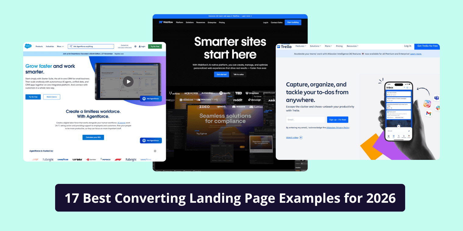
A call to action, commonly known as a CTA, is one of the simplest yet most powerful elements in marketing. Whether you’re running a website, writing emails, designing ads, or creating social media content, your CTA influences what the user does next. It tells the visitor exactly what action to take and guides them through your marketing funnel.
Understanding the meaning of a call to action and more importantly, how to write a good one can dramatically change your conversion rate. In this guide, you’ll learn what CTAs are, how they function, the different types, how to write effective CTAs, and how to strategically place them for maximum results.
What Does “Call to Action” (CTA) Actually Mean?
A call to action is a short phrase, sentence, button, or prompt that encourages users to take a specific next step. It acts as the connection between your content and the action you want the audience to take, such as buying a product, subscribing, downloading, booking, signing up, or learning more.
A CTA can be as simple as:
- Buy Now
- Get Started
- Learn More
- Download the Guide
Or more persuasive, like:
- Get 10% Off Today
- Start Your Free Trial – No Credit Card Needed
At its core, a CTA aligns user intent with business goals. When users land on your website or content, they’re always looking for what to do next. A strong CTA reduces friction, clarifies the path, and increases the chances of conversion.
Why CTAs Matter: Understanding User Behavior and Conversion Psychology
If you’ve ever visited a webpage and felt unsure about what to do next, that’s usually because there was no clear CTA. In contrast, high-performing websites guide visitors smoothly by offering the right CTAs at the right time.
CTAs matter for several reasons:
- They provide direction
Users want clarity. A CTA helps them easily understand what action to take. - They improve conversions
Whether you’re trying to generate leads, sell products, or grow an email list, CTAs directly impact conversion rates. - They influence user psychology
CTAs tap into motivation and urgency two crucial elements in decision-making. - They guide the user journey
From awareness to conversion, CTAs act as signposts that move users down your funnel.
Behind every great CTA is strong UX design: clear wording, smart placement, and visual hierarchy that draws attention without feeling pushy.
Types of CTAs You Should Know
CTAs come in many formats, depending on where you use them and what action you want users to take. Understanding the different types helps you choose the right one for each part of your funnel.
1. Website CTAs
These are the most common. They appear as buttons or links on landing pages, homepages, product pages, and service pages.
Examples include:
- Add to Cart
- Book a Call
- Start Free Trial
- Contact Us
Websites often have both primary CTAs (main action) and secondary CTAs (supportive action). A homepage might highlight “Get Started” as the main CTA and “Learn More” as the alternative.
2. Email CTAs
Email marketing relies heavily on CTAs to drive clicks and actions. These can be:
- Text hyperlinks
- Buttons
- Promotional banners
Good email CTAs are short, action-oriented, and aligned with the email’s purpose, such as Claim Offer, Download Report, or Reserve Your Spot.
3. Social Media CTAs
On platforms like Instagram, TikTok, Facebook, and LinkedIn, CTAs usually appear as captions, stickers, or prompts.
Common examples include:
- DM us to order
- Tap the link in bio
- Swipe up
- Share this post
These CTAs aim to drive engagement, boost reach, or push traffic to a landing page.
4. PPC and Ad CTAs
Paid ads on Google, Facebook, YouTube, and other platforms live and die on how compelling the CTA is. In ads, the CTA must be extremely direct.
Examples include:
- Shop Now
- Apply Today
- Try It Free
- Get Offer
A well-crafted CTA can increase click-through rate, reduce cost per acquisition, and improve ROAS.
5. Lead Generation CTAs
These CTAs are designed to capture emails or sign-ups by offering value such as:
- Free templates
- Checklists
- Ebooks
- Webinars
- Trials
Examples include Download Free Checklist or Get Instant Access.
How to Write an Effective CTA (with Real Strategies)
Creating a CTA that actually works requires more than picking attractive words. The best CTAs share specific characteristics that drive clicks, interest, trust, and conversions.
Use Strong, Clear Action Verbs
Start your CTA with a verb that leaves no doubt about what action should be taken:
- Buy
- Start
- Get
- Join
- Download
- Subscribe
- Learn
Action-oriented wording removes ambiguity and boosts conversions.
Match the CTA With User Intent
This is where most people go wrong. A CTA that works on a product page won’t work on an informational blog post.
If the user intent is informational, the best CTAs are softer:
- Learn More
- Read Guide
- Explore Features
- View Case Studies
If the user intent is transactional, use stronger CTAs:
- Buy Now
- Start Free Trial
- Book Appointment
- Get Instant Quote
Matching intent builds trust and leads to significantly higher conversions.
Keep It Short and Focused
The ideal CTA is usually between 2–5 words. Long CTAs overwhelm people. Short CTAs get clicked.
Highlight the Benefit
Users don’t just want to take action—they want a reason. Benefit-driven CTAs perform better because they answer the question: What do I get?
For example:
- Get 20% Off Today
- Start Free Trial – No Credit Card
- Download Free Ebook
Adding value immediately increases motivation.
Use Visual Contrast
A CTA button should visually stand out. This doesn’t mean using loud or ugly colors it means using contrast so the user’s eye naturally goes toward the button.
The CTA should be one of the most noticeable elements on the page without interrupting the design.
Best Practices for Placing CTAs on a Website
Even the best CTA fails if the placement is wrong. Strategic positioning helps guide visitors effortlessly and increases conversion rates.
Place a CTA Above the Fold
Users should see your main CTA without having to scroll. This is especially crucial for landing pages, homepages, and service pages.
Use Sticky Navigation CTAs
A “sticky” top bar with a CTA like Get Started or Book a Call keeps the action available at all times.
Avoid Overloading Pages with Too Many CTAs
Too many choices cause “decision fatigue.” Use one clear primary CTA and one secondary option if needed.
Optimize CTAs for Mobile Devices
Ensure buttons are large enough, clickable, and visually clear on smaller screens. Mobile conversions often depend heavily on mobile-friendly CTA design.
A/B Test CTA Copies and Styles
Small changes such as changing Get Started to Start Free Trial can increase conversions dramatically. Testing different colors, placements, and wordings helps you identify what performs best.
Examples of High-Converting CTAs
Seeing examples helps you understand what works in real-world scenarios.
High-Converting CTA Phrases
- Start Free Trial
- Book a Demo
- Get Started
- Join Free
- Download Free Guide
- Unlock Offer
- Add to Cart
- Claim Discount
These are straightforward, action-driven, and aligned with user expectations.
CTA vs CTA Button vs CTA Text: What’s the Difference?
Although these terms are often used interchangeably, they mean slightly different things.
CTA (Call to Action)
The overall prompt driving action.
CTA Button
A visual button designed to attract clicks.
CTA Text
The written copy inside the button or hyperlink.
Understanding the distinction helps you optimize both design and messaging.
CTA Search Intent: Informational + Transactional
Users searching for “call to action meaning” usually fall into two categories.
Informational Intent
These users want to:
- Understand what a CTA is
- Learn how CTAs work
- See examples
They are usually beginners or marketers learning fundamentals.
Transactional Intent
These users want:
- CTA examples
- CTA templates
- CTA ideas
- Best CTA practices for conversion
They are closer to taking action, designing pages, or improving funnels.
A good article satisfies both by providing knowledge + actionable strategies.
Common CTA Mistakes to Avoid
Even small mistakes can significantly reduce conversion rates. Some of the most common are:
- Using vague CTAs like “Click Here”
- Having too many CTAs on a single page
- Placing CTAs where users don’t see them
- Not aligning CTA with user intent
- Using generic wording with no value
- Not testing different CTA versions
- Weak contrast or poor visibility
Avoiding these mistakes alone can dramatically improve performance.
CTA Tools & Helpful Resources
To create, test, and analyze CTAs, marketers often rely on a few effective tools:
- Hotjar / Microsoft Clarity — for heatmaps and user behavior
- AB testing tools — for testing CTA variations
- UX design tools — for button design and layout
- Analytics platforms — to measure click-through and conversion rates
Using these tools ensures your CTAs are not just beautifully designed but also strategically optimized.
Conclusion
A call to action may look small, but it plays a massive role in user engagement and business growth. Understanding CTA meaning, user intent, and the psychology behind good CTAs allows you to design pages that convert more visitors into customers.
Whether you’re writing a blog post, designing a landing page, creating a social media campaign, or running ads, your CTA is the single element that determines what the user does next.
If you invest time into writing clear, compelling, benefit-driven CTAs and place them strategically you’ll see measurable improvements in conversion rates, sales, leads, and overall user experience.
FAQ’S
1. What do we mean by call to action?
A call to action (CTA) is a prompt that encourages users to take a specific action, such as clicking a button, signing up, making a purchase, or downloading a resource. CTAs guide users through the customer journey and help businesses achieve their goals.
2. What is a call to action example?
Examples of CTAs include “Buy Now,” “Start Free Trial,” “Learn More,” or “Download Free Guide.” These prompts tell users exactly what action to take next, improving engagement and conversions.
3. How to write a good call to action?
A strong CTA uses clear action verbs, matches user intent, highlights value or benefit, and stands out visually. For example: “Start Your Free Trial – No Credit Card Required” clearly tells the user what to do and why it’s valuable.
4. What is the main purpose of a CTA?
The main purpose of a CTA is to guide users toward a desired action while reducing friction. It helps turn visitors into leads, subscribers, or customers by clarifying the next step and creating urgency or motivation.
5. How long should a call to action be?
A CTA should typically be 2–5 words, short and punchy. This keeps it easy to understand at a glance while driving action, such as “Get Started,” “Buy Now,” or “Download Free Ebook.”
