A great landing page is more than a visually appealing piece of design it’s a strategic tool built to convert visitors into leads, customers, or subscribers. Whether you’re running ads, promoting a product, or generating leads for your business, your landing page’s performance directly influences your ROI.
But what exactly makes a landing page good? Why do some pages convert like crazy while others fail to generate a single lead? And how can you create a page that delivers clarity, trust, and results?
This comprehensive guide breaks down the key elements, psychological triggers, and technical fundamentals behind high-performing landing pages. By the end, you’ll know exactly how to create a landing page that not only attracts attention but motivates people to act.
What Makes a Good Landing Page? (Quick Answer)
A good landing page clearly communicates its value, focuses on one goal, uses persuasive copy, removes friction, builds trust, and guides visitors toward a single, compelling call-to-action. The best landing pages are clean, fast, mobile-friendly, and visually structured to reduce cognitive load.
If your page does these six things, you’re already ahead of most competitors.
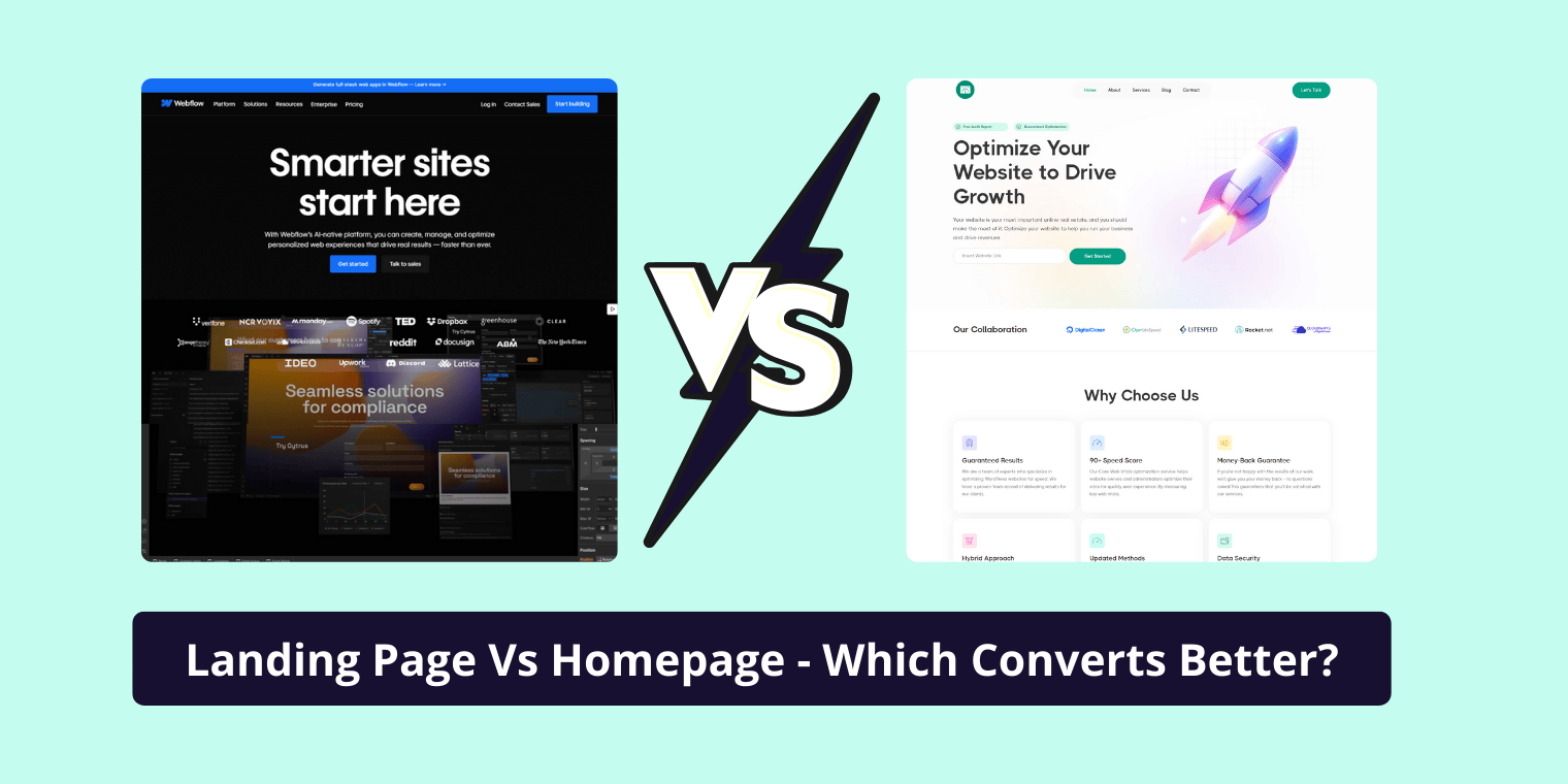
Understanding the Purpose of a Landing Page
Unlike a website homepage, which has multiple navigation paths, a landing page is built around a single conversion goal. That goal could be anything—downloading a PDF, signing up for a webinar, buying a product, or booking a consultation.
Common landing page purposes include:
Lead generation
For example, offering an ebook, checklist, or free consultation.
Product or service sales
Directly converting traffic into customers.
Ad campaign destinations
Highly targeted pages designed specifically for Google Ads, Facebook Ads, or TikTok Ads.
Event or webinar sign-ups
Driving registrations through dedicated event pages.
Email list building
Capturing subscribers with a value-driven incentive.
Whatever your goal is, everything on the page should push the visitor toward one action. Clarity equals conversions.
Key Elements of a High-Converting Landing Page
Successful landing pages don’t happen by accident they’re engineered. Let’s break down each core component and why it matters.
1. A Clear, Compelling Headline
Your headline is the first thing visitors see, and it often determines whether they stay or bounce. A strong headline communicates a clear benefit or solves a problem instantly.
Instead of being clever, aim for clarity.
Instead of being vague, aim for value.
Example of a strong headline:
“Increase Your Website Sales With Proven Conversion-Focused Landing Pages.”
It states the benefit directly and answers the visitor’s question: “What’s in it for me?”
2. Subheadline & Supporting Copy
Once the headline grabs attention, the subheadline reinforces the promise and gives additional clarity.
A good subheadline does one of these:
- explains the offer in simple terms
- clarifies who the offer is for
- highlights the main outcome
This combination creates a quick “aha” moment and encourages the visitor to keep scrolling.
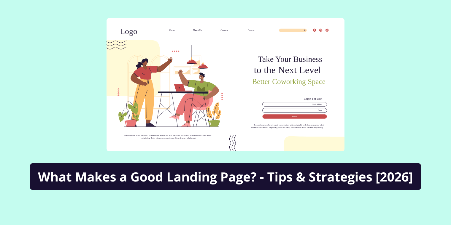
3. Above-the-Fold Content That Drives Action
The top part of your landing page (“above the fold”) plays a huge role in conversions. This section should include:
- your headline
- supporting subheadline
- a short list of key benefits
- a primary call-to-action
- a strong visual (image or video)
You want clarity, not clutter.
Most visitors decide in less than 5 seconds whether they’ll move forward. Make the first impression count.
4. A Strong, Persuasive Call-to-Action (CTA)
Your CTA is where the conversion happens. It should be visually prominent, action-oriented, and easy to understand.
Best practices include:
- using verbs (“Get Started,” “Download Now,” “Book Your Consultation”)
- placing your primary CTA above the fold
- avoiding vague CTAs like “Submit” or “Learn More”
- repeating the CTA throughout the page for long content
Color psychology also matters, but clarity matters more than color.
A good CTA tells the user exactly what happens next.
5. High-Quality Visuals & Media
Humans process visuals far faster than text. Good landing pages use strategic visuals that:
- showcase the product
- demonstrate the service in action
- reduce uncertainty
- help people visualize the outcome
Examples include:
- screenshots
- mockups
- explainer videos
- product photos
- testimonials with customer pictures
Avoid stock photos that look generic or fake they weaken trust.
6. Social Proof & Trust Elements
People trust people. Adding trust signals dramatically increases your conversion potential, especially for transactional pages.
Effective trust elements include:
- customer reviews
- testimonial quotes
- video testimonials
- star ratings
- case studies
- security badges
- industry certifications
- media mentions
- client logos
- before/after results
Trust is a core part of EEAT (Experience, Expertise, Authoritativeness, Trustworthiness), and landing pages with strong credibility outperform those without it.
7. Benefits Over Features
A common mistake is listing features instead of benefits. Features tell; benefits sell.
Here’s the difference:
- Feature: “Includes a 10-module video course.”
- Benefit: “Learn step-by-step how to master SEO even if you’re a beginner.”
People buy the outcome, not the product.
Show them how their life improves after taking action.
8. Form Optimization (For Lead Pages)
If your landing page includes a form, keep it simple. The more fields you add, the lower your conversion rate.
Best practices include:
- only ask for essential information
- use inline validation
- consider multi-step forms for higher conversions
- avoid unnecessary friction (“phone number required”)
- explain what happens after they submit
A well-optimized form feels easy, predictable, and safe.
9. Clean Layout & User Experience (UX)
A cluttered landing page overwhelms visitors and increases bounce rates. Good UX means:
- plenty of white space
- consistent spacing
- readable font sizes
- intuitive flow
- mobile-first design
- no distracting elements
Every part of the page should lead the visitor toward the goal. No guesses. No confusion.
Technical Elements That Improve Landing Page Performance
Even if your page has amazing design and copy, it can still fail if the technical foundation is weak.
1. Mobile Optimization
More than half of all traffic is mobile, and Google prioritizes mobile usability in rankings.
To optimize for mobile:
- make buttons large and tappable
- reduce large blocks of text
- ensure images scale properly
- avoid popups that block the screen
A mobile experience should feel as smooth as desktop sometimes even better.
2. Fast Loading Speed
Speed is a silent conversion killer. Slow pages lose impatient visitors long before they see your offer.
Improve speed by:
- compressing images
- removing unnecessary scripts
- using modern file formats like WebP
- enabling browser caching
- minimizing large page elements
A fast page keeps visitors engaged and improves your Quality Score if running ads.
3. SEO Basics for Landing Pages
Landing pages can rank in Google if optimized correctly but approach with caution. Landing page SEO should not compete with your main website’s content.
Follow this structure:
- unique title tag
- compelling meta description
- keyword-aligned headings
- structured content
- clean URL
- minimal navigation links
If your goal is paid traffic, SEO isn’t critical but it’s still good practice.
Psychological Principles That Increase Conversions
High-performing landing pages use psychology to motivate action. Not manipulation just understanding how real humans make decisions.
1. The AIDA Framework
AIDA is a timeless conversion formula:
- Attention: Your headline hooks the visitor.
- Interest: Your subheadline and content build curiosity.
- Desire: Benefits, visuals, and social proof create emotional buy-in.
- Action: A strong CTA pushes the visitor to convert.
This structure aligns perfectly with natural decision-making.
2. Cognitive Biases That Improve Conversions
Smart marketers use subtle psychological triggers. Common ones include:
- Social Proof Bias: “Everyone else uses it so I should too.”
- Scarcity: Limited spots or time-sensitive offers increase urgency.
- Anchoring: Showing a higher price first makes the actual offer feel more valuable.
- Authority Bias: Certifications, credentials, or expert reviews increase trust.
- FOMO: Fear of missing out motivates action fast.
Used ethically, these elements create momentum and reduce hesitation.
3. Storytelling for Emotional Connection
Facts tell. Stories sell.
Including a short narrative about the problem, transformation, or success story helps:
- build trust
- create relatability
- increase emotional engagement
People remember stories far more than features.
Types of Landing Pages
Landing pages aren’t one-size-fits-all. Choosing the right type ensures maximum conversions.
Lead Generation Landing Page
Collects emails or contact info in exchange for a valuable resource.
Sales Landing Page
Focuses entirely on selling a product or offer.
Click-Through Page
Used for PPC campaigns to warm up visitors before sending them to a checkout page.
Squeeze Page
A very short landing page designed solely to capture email addresses.
Webinar/Event Registration Page
Focused on signing up attendees for live or recorded events.
Product Landing Page
Showcases product features, benefits, use cases, and buying options.
Each page type has its own structure and purpose but all share the same core principle: one page, one goal.
Common Landing Page Mistakes to Avoid
Even experienced marketers make mistakes that destroy conversions. Some of the most common:
- overwhelming the visitor with too much text
- unclear or weak CTAs
- poor mobile experience
- cluttered design
- slow loading time
- too many form fields
- using stock photos instead of real visuals
- driving irrelevant traffic
- no clear value proposition
- no trust elements
Fixing these mistakes often results in instant conversion lifts.
Best Tools to Build High-Quality Landing Pages
You don’t need to know coding to build a great landing page. Popular tools include:
- Webflow – perfect for design-heavy, custom pages
- Unbounce – built for marketers and A/B testing
- Elementor – ideal for WordPress users
- Leadpages – great for beginners
- Instapage – high-end solution with advanced personalization
- HubSpot Landing Pages – excellent for CRM-integrated lead gen
Each tool offers templates, drag-and-drop builders, and optimization features.
How to Improve Landing Page Performance Over Time
Creating your landing page is only step one. Optimization is where results scale.
1. A/B Testing
Split testing allows you to compare versions of your page to see what converts best.
Test elements like:
- headlines
- CTA text
- button color
- hero images
- form length
- pricing layout
- testimonials
Small changes often produce big results.
2. Heatmaps & Behavior Analytics
Tools like Hotjar and Microsoft Clarity show you:
- where visitors click
- how far they scroll
- what they ignore
- where they drop off
This data helps you identify friction points and improve usability.
3. CRO (Conversion Rate Optimization) Metrics
Track key performance indicators such as:
- conversion rate
- click-through rate
- bounce rate
- time on page
- form completion percentage
Consistent monitoring is essential for long-term success.
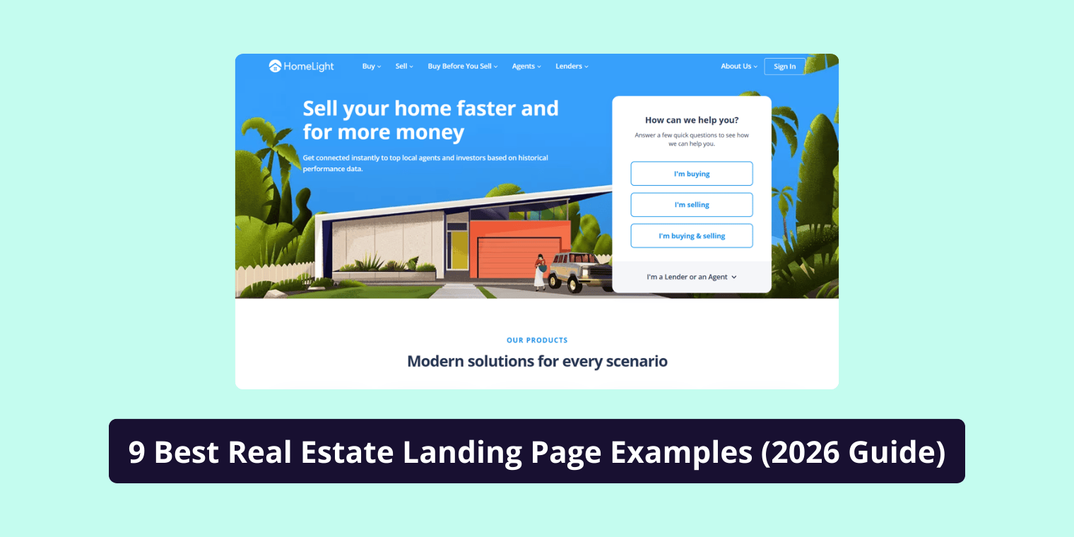
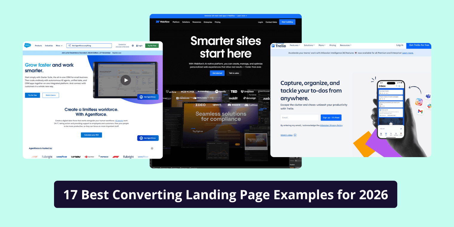
Examples of High-Converting Landing Pages
While every page is unique, the best landing pages share these characteristics:
- a clear value proposition
- strong above-the-fold section
- compelling visuals
- concise and benefit-driven copy
- strong trust signals
- a single conversion focus
- clean design and fast loading
Studying successful pages helps you understand what works and why.
Checklist: What Makes a Good Landing Page
Before launching, confirm your page meets these criteria:
- One clear goal
- Compelling headline and subheadline
- Strong, eye-catching CTA
- Value-driven benefits
- Clean design and layout
- Strong visuals and media
- Trust elements and social proof
- Fast loading speed
- Mobile-optimized
- Simple form (if applicable)
- SEO-friendly structure
Ticking all these boxes gives your landing page the best chance to convert exceptionally well.
Conclusion
A good landing page isn’t built with guesswork. It’s a strategic blend of clarity, design, psychology, and technical performance. Whether your goal is leads, sales, or sign-ups, the principles in this guide help you craft a page that engages visitors and motivates them to act.
The best landing pages continually changes. Test them, refine them, and always focus on delivering the clearest path to value and conversions will follow.
FAQ’S
1. What makes a good landing page?
A good landing page is clear, focused, and built around one goal. It uses a strong headline, benefit-driven copy, trust elements, fast loading speed, and a prominent call-to-action. The design reduces distractions and guides visitors smoothly toward taking action, improving both engagement and conversion
2. What is the most important element of a landing page?
The most important element of a landing page is a clear and compelling value proposition. It should instantly tell visitors what you offer, who it’s for, and why it matters. When users understand the benefit within seconds, they’re far more likely to stay on the page and convert
3. What does a successful landing page look like?
A successful landing page is simple, visually clean, and focuses on one call-to-action. It includes a strong hero section, persuasive copy, trust signals, relevant visuals, and an easy-to-use layout. Everything on the page supports one goal, removing friction and making the next step obvious.
4. What are the requirements for a landing page?
A landing page requires a clear headline, a single conversion goal, benefit-focused content, strong CTAs, trust elements, mobile-friendly design, fast loading speed, and relevant visuals. These elements work together to improve clarity, reduce friction, and maximize conversions for ads, SEO, or lead generation
5. What makes a bad landing page?
A bad landing page is confusing, cluttered, slow, or unfocused. Weak messaging, too many distractions, long forms, poor mobile design, and lack of trust signals cause visitors to leave quickly. Any page that doesn’t clearly explain its value or guide users to one action will perform poorly
6. What is the first thing to see on a landing page?
The first thing visitors should see on a landing page is a clear headline that communicates the main benefit. Paired with a supporting subheadline and a visible call-to-action, this above-the-fold section sets expectations, builds interest, and encourages users to continue engaging with the page.
7. What is the best layout for a landing page?
The best layout for a landing page is a clean, linear structure that moves the user from headline to benefits, visuals, social proof, and finally the call-to-action. This “top-down” flow reduces cognitive load, keeps attention focused, and increases the likelihood of conversions.