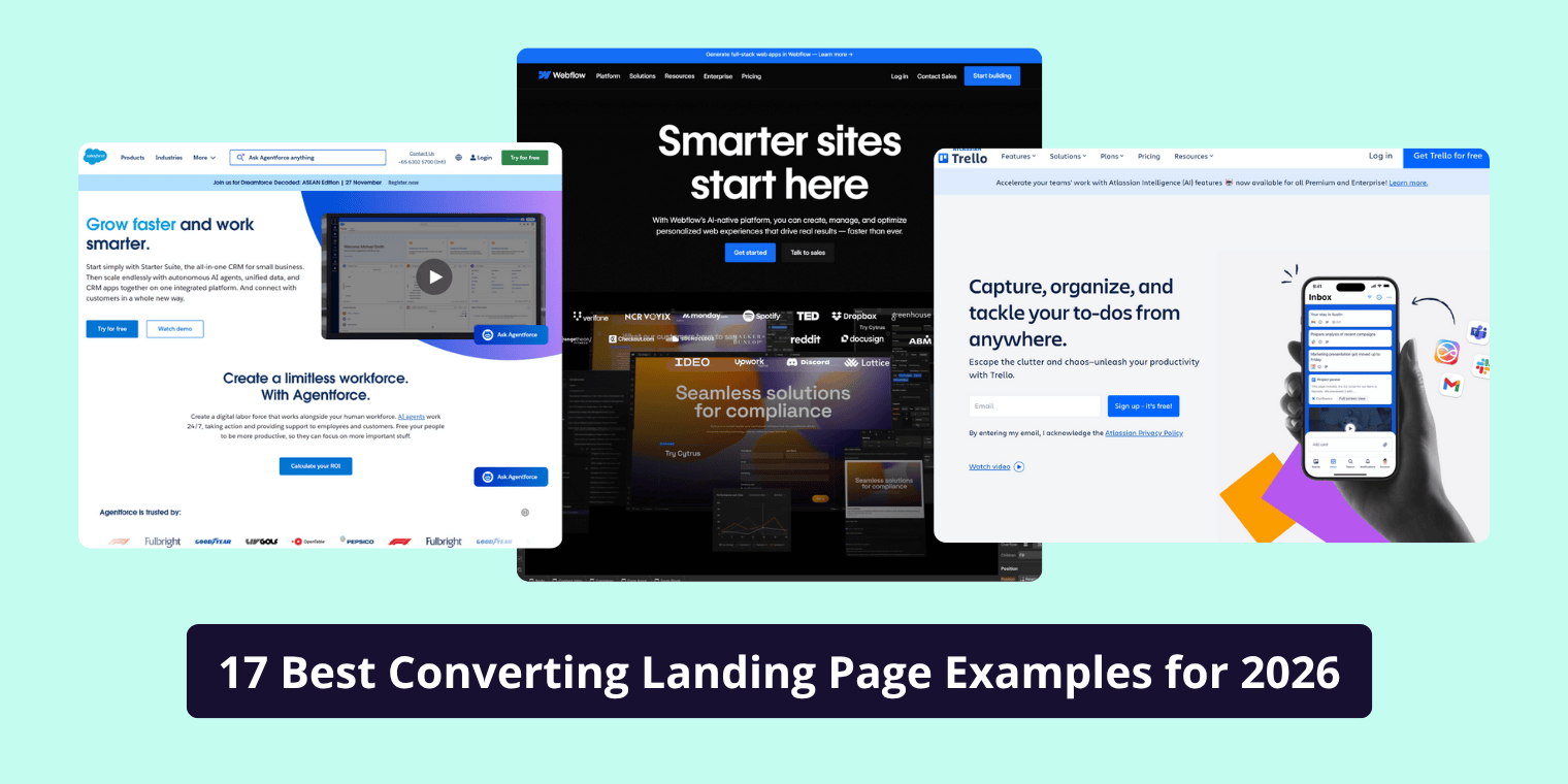
A landing page can make or break your marketing campaign.
It’s where your ads, social media links, or email campaigns send visitors and it’s the page that decides whether those visitors turn into customers or leave forever.
Yet most small businesses get it wrong cluttered layouts, vague messaging, and weak calls-to-action (CTAs) cause conversion rates to drop fast.
In this guide, we’ll walk through how to structure a high-converting landing page step-by-step with real examples, a proven framework, and actionable tips you can use today.
What Is a High-Converting Landing Page?
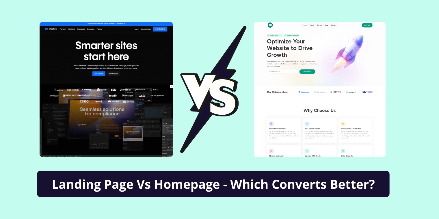
A landing page is a standalone web page designed for one goal usually to convert visitors into leads or customers.
Unlike a homepage, which covers everything about your business, a landing page focuses on one product, service, or offer.
A high-converting landing page is one that’s built with clarity, persuasion, and simplicity leading to more clicks, sign-ups, or sales.
Example:
A plumbing company runs a Google ad offering “Free Inspection on First Service.” The ad leads to a landing page where users can enter their contact info to book. The page has no navigation, just a clear message, trust elements, and one call-to-action “Book My Free Inspection.”
That’s a high-converting landing page in action.
The Psychology Behind Conversions
Great landing pages are built on psychology, not just design.
Here’s what drives people to take action:
| Psychological Trigger | Why It Works | How to Apply It |
|---|---|---|
| Clarity | People act when they understand quickly. | Keep your headline simple: “Get X in Y days” |
| Trust | Visitors won’t share info if they don’t trust you. | Add testimonials, badges, and reviews. |
| Relevance | If your offer doesn’t match their intent, they bounce. | Align ad copy with landing page copy. |
| Social Proof | People follow others’ choices. | Show customer logos or success numbers. |
| Visual Hierarchy | Eyes follow patterns and contrast. | Highlight your CTA in a contrasting color. |
By using these psychological principles, you create an emotional and logical reason for users to convert.
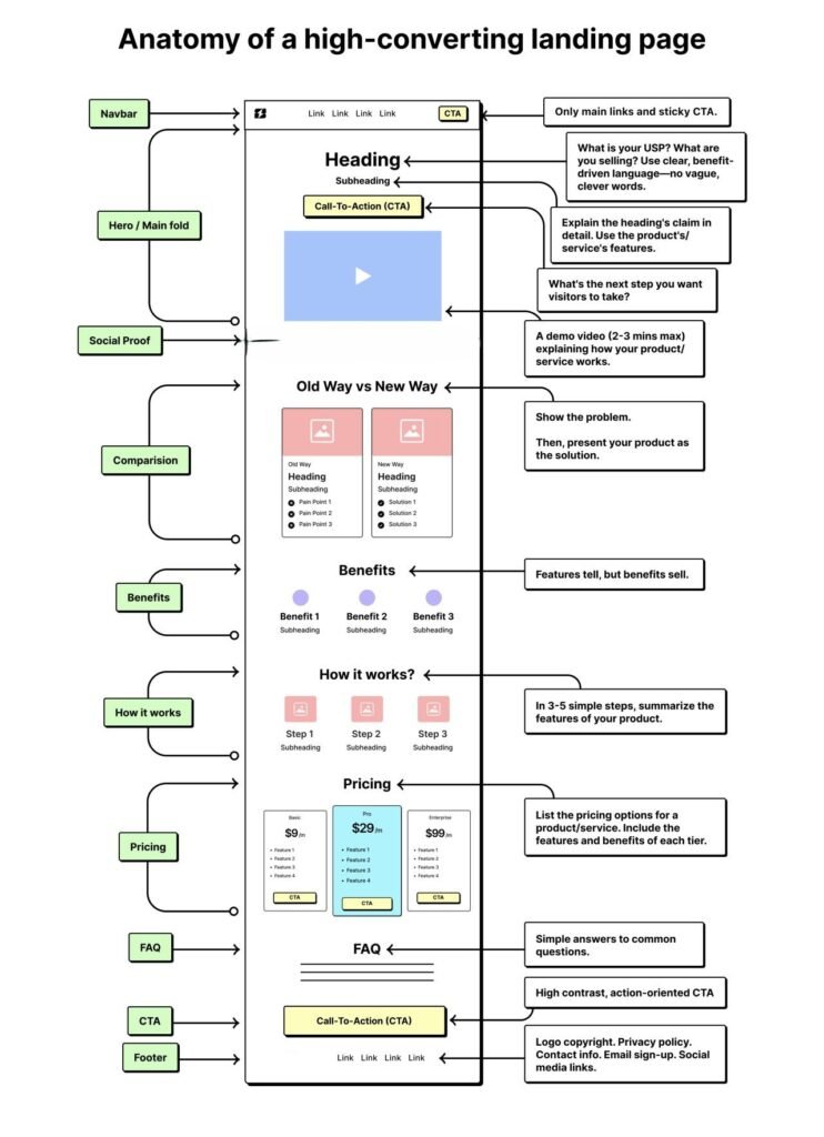
Core Structure of a High-Converting Landing Page
Let’s break down the essential building blocks of a landing page that converts.
| Section | Goal | Optimization Tip |
|---|---|---|
| 1. Hero Section (Above the Fold) | Capture attention instantly. | Use a benefit-driven headline and one strong CTA. |
| 2. Subheadline | Clarify what’s being offered. | Explain your value in one sentence. |
| 3. Hero Image/Video | Visual context. | Use product demos or smiling human faces. |
| 4. Social Proof | Build immediate trust. | Add testimonials or star ratings. |
| 5. Features & Benefits | Show value clearly. | Use bullet points and icons. |
| 6. Lead Capture Form | Collect visitor info. | Limit to 2–3 fields max. |
| 7. Trust Signals | Reduce hesitation. | Include badges, guarantees, SSL symbols. |
| 8. Secondary CTA | Re-engage scrollers. | Add another button mid-page or end. |
| 9. Footer | End page cleanly. | Add contact info or legal links only. |
Each element should serve a single purpose guiding the visitor toward your conversion goal (signup, booking, download, or purchase).
1. Hero Section — Capture Attention Instantly
This section must do three things instantly:
- Tell the visitor what you’re offering.
- Tell them why it’s valuable.
- Tell them what to do next.
Best practice blueprint (5 elements):
- Headline: main benefit (6–12 words)
- Subheadline: supporting detail (1 sentence)
- Supporting image/video: shows the outcome
- Primary CTA: short, benefit-oriented (1–3 words)
- Microcopy under CTA: clarifies commitment or privacy
Headline formulas (fill in the blanks):
- “Get [result] in [timeframe]” → “Get 15 New Customers in 30 Days”
- “Stop [pain] with [solution]” → “Stop Losing Leads — Landing Pages That Convert”
- “[Benefit] for [audience]” → “Automated Bookings for Local Restaurants”
CTA examples:
- Primary: “Book Free Call”, “Start Free Trial”, “Get My Checklist”
- Secondary (less prominent): “See Pricing”, “Compare Plans”
Technical tip: Place CTA as a button element (not an anchor) and ensure it’s keyboard focusable and accessible for screen readers.
2. Problem & Solution — Build Emotional Connection
After grabbing attention, make your visitor say, “Yes, that’s exactly my problem.”
How to Structure
- Describe the pain point: “Are you getting traffic but no conversions?”
- Agitate the pain: “You’re investing time and money, but your visitors leave without taking action.”
- Present your solution: “Our proven landing page structure converts clicks into customers.”
Why This Works
This sequence (Problem → Agitate → Solution) triggers empathy and shows expertise — aligning with EEAT by demonstrating experience and understanding of real business challenges.
3. Social Proof — Build Trust and Credibility
Small business owners often hesitate because they fear wasting money.
That’s where social proof steps in.
Forms of Social Proof
| Type | Example |
|---|---|
| Testimonials | “We increased leads by 40% after the redesign.” |
| Case Studies | “How ABC Plumbing got 60 new calls per month.” |
| Reviews & Ratings | Google, Clutch, or Trustpilot badges |
| Logos | “Trusted by 300+ businesses” |
| Media Mentions | “As featured in Forbes” |
People don’t believe vague praise. They believe specific results, names, and numbers.
High-impact social proof elements:
- Short testimonial (1–2 sentences) + photo + name + location + exact result.
- Client logos (only real clients).
- Quantified result badges (e.g., “Avg. 34% lift in leads”).
- Video testimonial (30–60s) — high conversion power.
Placement: Put a compact set of testimonials immediately after the hero or overlaid in the hero if space allows.
Example testimonial microcopy:
“We doubled online bookings in 6 weeks. The new landing page paid for itself in month one.” — Ayesha Khan, Owner, Sunrise Café
Avoid: anonymous testimonials (“A business owner said…”) — they carry less weight.
EEAT Connection
Social proof builds Trustworthiness and Authoritativeness, two key pillars of EEAT — showing real-world validation.
4. Core Benefits — Sell the Outcome, Not the Features
Instead of focusing on what your service does, show what results it delivers.
Example Table: Features vs. Benefits
| Feature | Benefit |
|---|---|
| Fast-loading design | Visitors stay longer and convert more |
| Mobile optimized | Reach users on any device |
| A/B tested layouts | Better ROI from every visitor |
| Integrated analytics | Know exactly what’s working |
Explanation
Under each benefit, add a one-sentence result statement like:
“That means less bounce rate, more inquiries, and steady growth.”
Remember: People buy transformation, not tools.
5. Visuals & Proof — Reinforce the Message
Humans process visuals 60,000x faster than text.
Include:
- Product mockups or screenshots
- Before-and-after comparisons
- Short testimonial videos
- Data visuals (conversion stats, growth graphs)
Example
If you’re promoting website redesign services, include a before/after screenshot showing improvement in layout and lead form visibility.
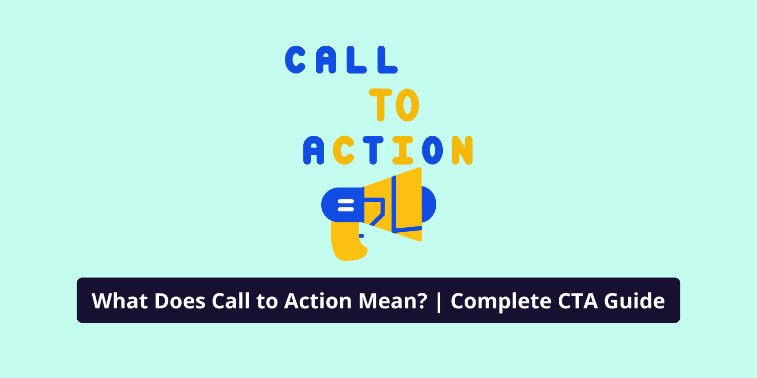
6. Call to Action (CTA) — The Conversion Trigger
Your CTA is where visitors decide.
The difference between “Learn More” and “Get Started Now” can double conversions.
Best Practices for CTAs
- Use action verbs: Get, Start, Download, Claim, Access
- Make it benefit-focused: “Get My Free Quote” vs “Submit”
- Place CTAs strategically (above the fold + after key sections)
- Use contrasting button colors
Example CTA Copy
- “Book My Free Strategy Call”
- “Download My Conversion Checklist”
- “See Pricing & Packages”
7. Trust signals & objection handling — what to show and where
Use trust signals to remove the last hesitation. Place them near the CTA or form:
- Technical trust: SSL badge, secure payment logos, PCI compliance (if selling).
- Business trust: Company registration, awards, years in business (e.g., “Serving since 2015”).
- Social trust: Number of customers, average rating + review count.
- Guarantees: “30-day money-back” or “Satisfaction guaranteed.”
Objection handling microcopy: “No credit card required” or “Cancel anytime” directly under CTA reduces friction.
This section answers the “what ifs” and “buts” in your visitor’s mind.
8. Forms and fields — How to capture leads without killing conversion?
Principles:
- Ask for the minimum info needed.
- Use progressive profiling for more details later.
- Explain why you need information (microcopy).
Form best practice examples by offer type:
- Low friction (ebook/checklist): Email only → CTA “Send My Checklist”
- Medium friction (consultation): Name + Email + Phone + One qualifying question → CTA “Book My Audit”
- High friction (demo/paid): Name + Email + Company + Budget range + Calendly → CTA “Request Demo”
Microcopy examples:
- Under email field: “We never share your email. Unsubscribe anytime.”
- Under phone field: “Optional. Helps us schedule your call.”
Security & privacy: show a small “SSL secured” icon and link to privacy policy near the submit button.
9. Page speed & mobile — Specific tactics to improve conversions
Why it matters: 1 second delay can drop conversions significantly. Mobile must be prioritized.
Speed checklist (practical):
- Compress images (WebP) and lazy-load below-the-fold images.
- Serve scaled images with
srcsetfor responsive sizes. - Use a CDN (Cloudflare or similar).
- Minify CSS & JS; defer non-critical JS.
- Preconnect to analytics providers and third-party scripts.
Mobile UX tips:
- Buttons min width 44px (easy to tap).
- Use single-column layout; avoid wide paragraphs.
- Sticky CTA for long pages (but don’t obscure content).
10. Footer — Reinforce Brand & Offer
Your footer should quietly support conversion and credibility.
Include:
- Secondary CTA (e.g., “Book Your Free Audit”)
- Contact info
- Social links
- Legal pages (Privacy, Terms)
- Certifications or seals
This is your final touchpoint for building trust before the user leaves.
Measurement & Testing — Set up a CRO loop
Tools to use: Google Analytics (GA4), Hotjar, an A/B testing tool (VWO, Google Optimize), and heatmaps.
Minimum events to track:
- Pageviews
- Clicks on primary CTA
- Form submissions (conversion)
- Scroll depth (50%, 75%, 100%)
- Bounce rate by source
A/B test ideas (concrete experiments):
- Headline A vs Headline B — test benefit vs feature headline.
- CTA color — original vs high contrast color (keep rest same).
- Form length — 3 fields vs 1 field.
- Social proof placement — hero vs below benefits.
- Hero image type — product screenshot vs human photo.
How to run: Run one test at a time; aim for statistical significance (use tool guidance). Iterate based on winning variation; then start the next test.
Create Copy That Converts
The copy (text) of your landing page matters more than the design.
Follow this simple copywriting structure:
- Headline – State the main benefit.
- Example: “Get More Leads from Your Website in 7 Days.”
- Subheadline – Clarify what the offer is.
- “Our proven system helps you convert visitors into customers faster.”
- Bullet Points – Highlight 3–5 key benefits.
- “Save time,” “Increase conversions,” “No coding needed.”
- Call-to-Action – Direct and benefit-focused.
- “Start Free Trial,” “Book My Call,” or “Download Now.”
Best Practices:
- Write as if speaking to one person.
- Avoid jargon — clarity beats cleverness.
- Use “you” and “your” — it personalizes the offer.
How to Optimize Your Landing Page for Higher Conversions
Here’s a step-by-step conversion optimization plan:
| Step | Action | Tools to Use |
|---|---|---|
| 1. Track Behavior | Use analytics to see where users drop off. | Google Analytics, Hotjar |
| 2. A/B Test Headlines & CTAs | Test small copy changes for big gains. | Google Optimize, VWO |
| 3. Improve Load Speed | Compress images & minify code. | PageSpeed Insights |
| 4. Review Form UX | Fewer fields = higher conversions. | HubSpot Forms, Typeform |
| 5. Collect Feedback | Ask why users didn’t convert. | Hotjar polls, Feedback widgets |
Regularly test and refine — even 1% improvement per month compounds massively.
Example A/B test plan (30 days)
Objective: Increase demo requests by 20%
Week 1: Baseline — measure current conversion rate and traffic sources.
Week 2: Test 1 — Headline A (benefit) vs Headline B (feature). Run until statistical significance.
Week 3: Implement winner; Test 2 — Reduce form fields (Name + Email vs Name + Email + Phone).
Week 4: Review results — roll out best variants to all traffic and plan next month’s tests.
Metrics to watch: conversion rate, cost per lead (if using paid ads), form abandonment rate.
Common Mistakes That Kill Conversions
Even the best offer fails if the page has these issues:
- Too many CTAs → Confuses the user.
- Slow page load → Visitors leave before it loads.
- No clear value proposition → “What’s in it for me?” unanswered.
- Generic stock photos → Feel fake or irrelevant.
- No trust signals → Users hesitate to share info.
Quick Fix: Simplify design, focus messaging, and add real testimonials.
SEO Optimization for Landing Pages
Landing pages can rank and convert if structured properly.
SEO Checklist
- Use keyword-rich headlines (H1, H2)
- Optimize meta title & description
- Include internal links to supporting pages
- Add alt text for images
- Use structured data (FAQ schema, product schema)
- Ensure fast load speed (<2s)
Example Schema Markup (FAQ)
{ “@context”: “https://schema.org”, “@type”: “FAQPage”, “mainEntity”: [{ “@type”: “Question”, “name”: “What makes a landing page high-converting?”, “acceptedAnswer”: { “@type”: “Answer”, “text”: “A high-converting landing page has a clear offer, social proof, benefit-driven copy, and a strong CTA.” } }] }
Final Checklist: The Perfect Landing Page Flow
Use this before you publish:
- Headline clearly states the main benefit.
- Subheadline clarifies who it’s for and what you deliver.
- CTA is visible above the fold and repeated at key points.
- Visuals support the message (no irrelevant stock photos).
- Social proof: at least 3 short testimonials or logos.
- Form uses minimal fields; privacy microcopy present.
- Trust badges + guarantee near CTA.
- Page load under 3 seconds (test in PageSpeed Insights).
- Mobile friendly (buttons tapable, responsive images).
- Analytics + conversion events configured.
- One A/B test planned for next 30 days.
Conclusion
A high-converting landing page isn’t about fancy design it’s about understanding your users.
When you align clarity, trust, and value, conversions follow naturally.
Even small business owners can create pages that perform like big brands all it takes is the right structure and message.
Start by optimizing your next campaign landing page using this framework and watch your conversions climb
FAQ’S
1. What is a high-converting landing page structure?
A high-converting landing page structure is a strategic layout designed to guide visitors toward taking a specific action — like signing up or purchasing.
It typically includes:
- A compelling headline
- Clear subheadline
- Value-driven visuals
- Social proof (testimonials or stats)
- Benefits-focused content
- A strong call-to-action (CTA)
- Minimal distractions
This structure helps build trust, capture attention, and improve conversion rates.
2. How to structure a good landing page?
To structure a good landing page:
- Start with a clear headline that states the main benefit.
- Add a short intro or subheadline that explains your offer.
- Use visuals or videos to show your product/service in action.
- Highlight 3–5 key benefits or pain points you solve.
- Add testimonials or trust logos to build credibility.
- Place a single, visible CTA button above the fold and repeat it below.
- End with FAQs or a final persuasive statement.
This logical flow keeps users engaged and leads them naturally to convert.
3. What makes a bad landing page?
A bad landing page confuses visitors, loads slowly, and fails to communicate value.
Common mistakes include:
- Cluttered design or too much text
- Weak or unclear CTA
- Generic headlines
- No trust signals (reviews, guarantees)
- Poor mobile experience
- Irrelevant or misleading visuals
Such pages lose user trust and lead to high bounce rates and low conversions.
4. What is the best format for a landing page?
The best format for a landing page is single-column and scroll-based, optimized for both desktop and mobile.
Key layout zones include:
- Top: Headline + CTA
- Middle: Product/Service explanation + Benefits
- Lower: Testimonials, FAQs, and a repeat CTA
This clean, vertical format reduces distractions and helps users focus on your message.
5. How many sections should a landing page have?
An effective landing page typically has 5 to 7 sections, depending on the offer.
A standard structure includes:
- Hero section (headline, subheadline, CTA)
- Value proposition
- Benefits/features
- Social proof/testimonials
- CTA section
- FAQs or guarantee
- Closing CTA
Too few sections can feel incomplete; too many can overwhelm users.
6. What does a successful landing page look like?
A successful landing page looks clean, focused, and user-friendly. It has a powerful headline, clear visuals, trust signals, and a single primary CTA.
For example, Dropbox’s minimalist landing page highlights its main benefit (“All your files in one place”) with a simple signup form — reducing friction and boosting conversions.
7. What is the most important part of a landing page?
The most important part of a landing page is the headline — it determines whether visitors stay or leave.
A strong headline clearly communicates the main benefit and matches user intent. It should instantly answer, “What’s in it for me?” while aligning with your ad or campaign promise.